


If you’ve already read Depth Maps: How Computers Encode 3D Space then you understand conceptually what an RGB-D is, what it is used for, and how you can use it yourself. If you haven’t, I highly recommend you read it before continuing down this road.
Here we’ll focus on what the best practices for depth maps are - meaning, how to capture and convert standard images, or RGBs, into RGB-Ds, how to tell what images and photos will create a good depth map, and how to compare the results on a Looking Glass Display.
Understanding and rendering depth maps is a work of art on its own - that is to say, you can figure out how to give the computer the data it needs to make really good depth maps to render them in 3D or as holograms.
2D to 3D Converter is Looking Glass’ AI-assisted software that creates a depth map pair to the uploaded RGB image or photo. You can upload photos captured on your phone, DSLR, or film camera, images rendered from software like Blender, Cinema4D, or Midjourney, and even stills from your favorite movie or TV Show.
.jpeg)
.jpeg)
.jpeg)
.jpeg)
Though the mechanics of uploading an image into the converter are quite easy, there are images that make for better depth maps than others. When you understand why that is, you’ll be able to get to a place where you don’t need to convert an image to intuit whether or not it’ll output a great depth map pairing.
However, don’t stop yourself from exporting an RGB-D that you really want to see in 3D based on these best practices. Even if AI-assisted software can’t give you exactly what you want, you can always edit depth maps or create them on your own. These best practices will serve you well for those endeavors, too.
First order of business is to discuss what makes a “good” depth map.
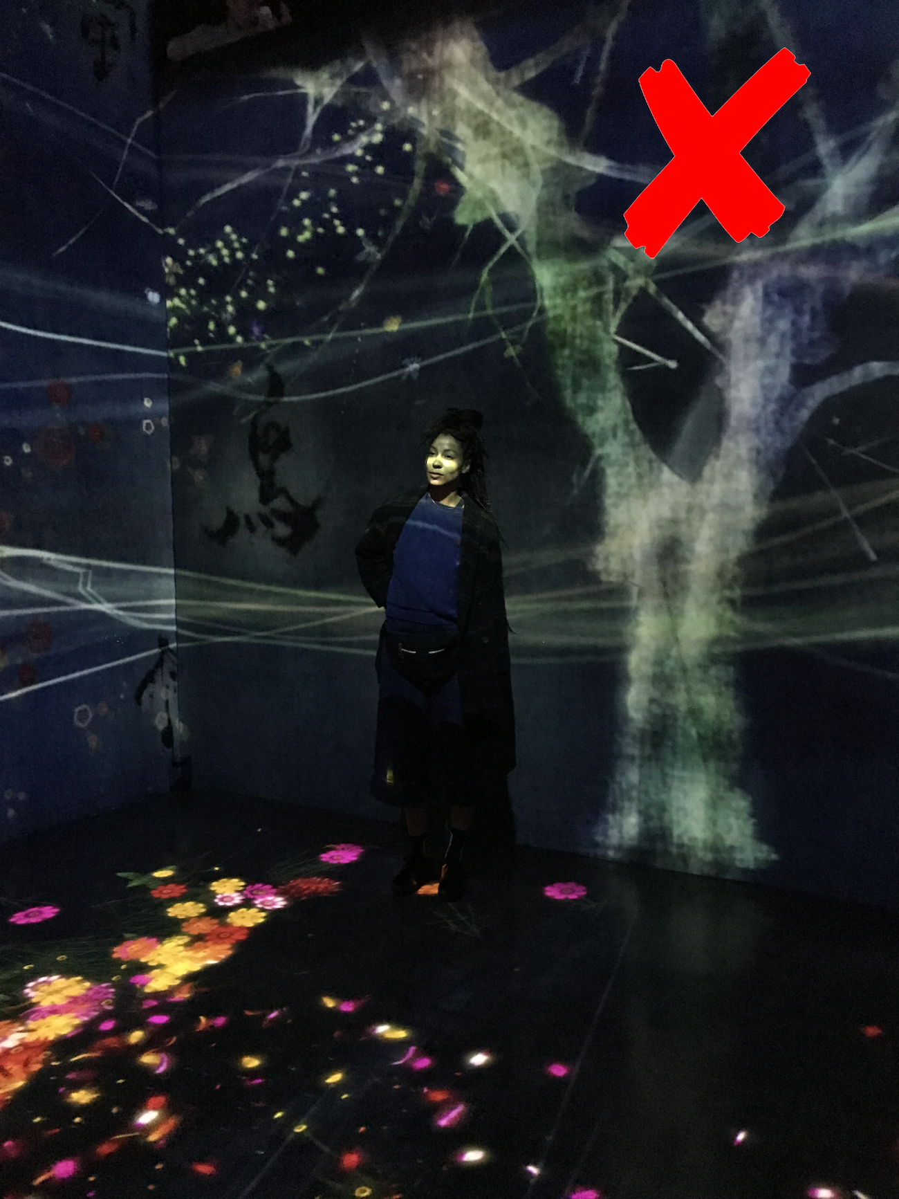
As you learned, there are so many ways that you can use depth maps. We will focus on using depth maps in a holographic display here, so our definition of “good” relies on that context. Good here means realistic, quality 3D - it means that the RGB-D image translates seamlessly as a 3D image in a holographic display, with verisimilitude to what was literally captured in 3D space as a photograph or to what one would imagine in their stereoscopic mind’s eye as to how the 3D image should be rendered.
If you need a refresher, check out the section on “Why We Need Depth Maps,” in “What is a Depth Map?”, where we talk briefly on how your brain interprets 3D space in 2D images.
Usually, it’s better to start with good feedback before you hone in on the constructive feedback. But in this case, we’re going to do the opposite.
To understand what a good depth map looks like, we’ll look at what a not-so-good depth map looks like first and talk about why it could be better.
.jpeg)
This is a beautiful portrait from Pixabay, a platform for free images. Even though this image is quite nice, from just the RGB we can assume that this will make for a not-so-good depth map. The high contrast of the sun behind the subject and the subject being lower lit will probably affect the depth map around the subject’s silhouette.
Also, because there isn’t much data between the subject and the lens, and the subject at the back of the image, we can assume that there won’t be a rich gray gradient but rather sharp contrasted whites against blacks (which we’ll dub the cardboard cutout effect).

Here you can see that the depth map doesn’t do a good job with the tendrils of hair that are blown out by the sun. The subject is flat and white, with sharp contrast from her silhouette to the background. The depth map did pick up the slope of the mountain to the left, but doesn’t make out the clouds in the distance. Not a good depth map.
%20(1).jpeg)
Take a look at the RGB-D pair above as one more example before we move on to what makes a “good” depth map. While the first pair mainly pointed at the importance of consistent lighting, this RGB-D image of a sunset in Poreč, Croatia shows the importance of avoiding landscape scenes without clear subjects.
The grayscale gradient does okay with the ocean at the foreground of the image, but sharply dips to black once the scene reaches the outline of the land in the middle of the photo and the sky.
.jpeg)
Here we have another photo from Pixabay, but this time to example RGB images that create good depth maps. Here the lighting is consistent, and the grass moves consistently from the foreground of the photo to the background. We can assume that’ll create a beautiful rich slope of a gradient from the front to the back of the image.
The subject of the photo is well lit and defined, and we should see no issues with the software encoding their foot and the hands reaching for the foot as the closest part of the subject and the chest and back area being the furthest part of the subject. It’s a toss up, though, if the depth map will be able to make out the details of of the trees in the background.

If you squint, you can see that the depth map did just barely make out the silhouette of the trees in the darkest part of the image. As we predicted, the grass slopes towards the background in a gentle gradient. And the sole of the foot is the whitest part of the subject’s body, followed by the hands and shin, while the darkest grays sit on the chest and hips of the subject.

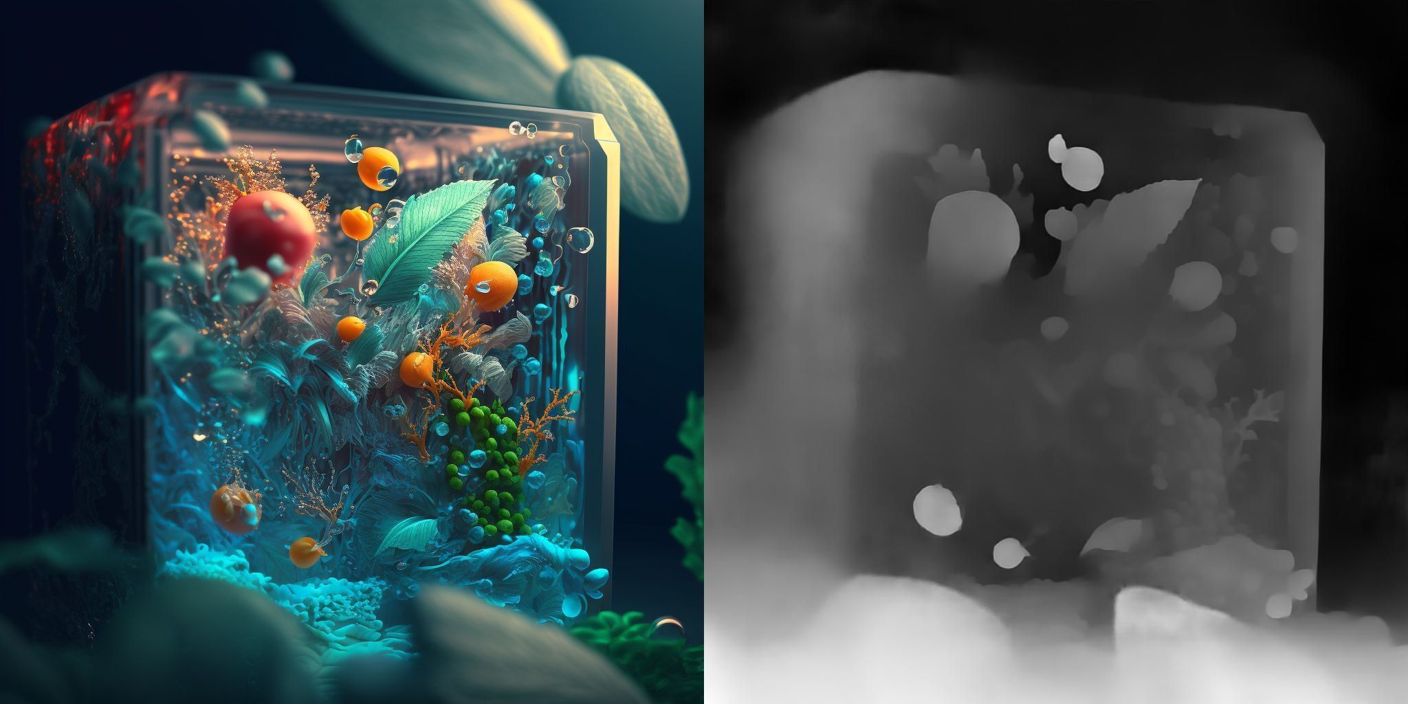
Here is another example of a very good depth map pair. This image was created using Midjourney (keywords: Sailor Moon Christmas Decoration). In the foreground out of focus are Christmas bobbles that frame the portrait. The Christmas tree extends out towards the foreground and leads to the back of the image, behind the subject. There are little gaps between the lens and the objects leading from foreground to background, the bobbles to the Christmas tree. It is consistently lit, with the focal plane on the Sailor Moon figurine.
The depth map shows a nice gradient between the bobbles and the Christmas tree, with the body of the Sailor Moon figurine a smooth gradient as well.
A richer gradient with smooth transitions from white to black is the most ideal depth map for our use case. And there are some ways that you can identify which RGBs will create a smoother gradient than others.
As we saw in the Not-So-Good depth map examples, high contrasted lighting can confuse the software’s identification of the object and big spaces between the objects and the lens (or between objects in the scene) can make sharp jumps from white to black in the depth map pair.
In the Good depth map examples, we see that having ascending or descending imagery (like the grass sloping into the back of the image, or the Christmas decorations and tree extending from the foreground to the background of the image) create rich gentle gradients in the depth map.
1. There is continuity between the foreground and the background of the render or photo (ascending or descending)
.png)
Images or photos that are cropped shots or close up on the subject usually don’t need to worry about this point. However, if your image is of landscape photography or has a lot of information in it, this is an important point. Large gaps between subjects creates cardboard cutout effects in the Looking Glass.
2. There is consistent lighting in the image or photo
In our case, the AI is doing their best to make sense of this human world so they can see it too. If there is high contrasted lighting on objects, this can affect what it estimates is the entire object in the image.
3. There is light and shadow in the scene
Even though we don’t want the lighting to be too highly contrasted, it does help to have natural shadows and lighting differences that occur in real life. So many times, cartoons don’t work as well - especially cartoons in flat lighting.

4. The RGB pair is clear
The uploaded photo should be easy to read - experimental photos, shaky images, unclear objects, pixelated images… might make something super interesting in the depth map but not necessarily something we define as “good” in this article.
These are just some guidelines that we’ve found to be helpful when we convert RGBs that we think will create stellar depth maps. However, you should try to convert or create RGB-Ds that use and break these guidelines to see what you can come up with.
Who knows, maybe you will find some strategies that we haven’t even seen before and break new ground.
Looking Glass hosted a live stream about this very topic last December, that was a fun competition over which RGBs made the best depth maps. Check out the competition in the video above and see how each RGB faired as a RGB-D after conversion.
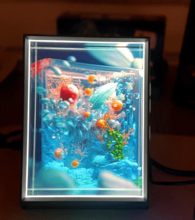
We’ll finish this post with some RGB-D pairs next to footage of how they look in a Looking Glass Portrait to illustrate the power of “good” depth maps!
⬇️⬇️⬇️


.gif)
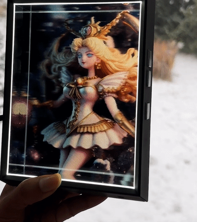
If you have a Looking Glass already, just right click and save all of the RGB-D images in this post to check them out on your own in Looking Glass Studio. You can even pull in the “not-so-good” depth maps as a comparison. Or check out our 2D to 3D Conversion software and start uploading your own images right now.
If you don’t have a Looking Glass, join our Discord and introduce yourself to our growing holographic creative community and get acquainted with the world’s first personal holographic device. And check out the video above.
